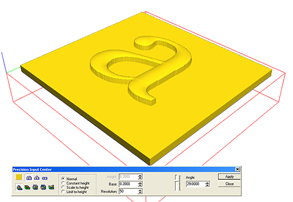
I started with a square shape and a letter 'a' once more. Then I selected the square and created a flat relief that was 0.3" thick.
Then I selected the box and the letter 'a' vector and used the bevel tool to modify the base relief by adding the beveled letter. I used a base of 0.2" (this means the sides of the letter are 0.2" tall before the bevel starts.) I used a little steer angle than I usually would have because it shows the things I want to better than if I had used a shallower angle. In the top view it looks pretty good at first glance but if you look close (red arrows) you can see that where the thin strokes join up with the thick ones it is not quite right.
The perspective view doesn't show much from this angle and the letter actually looks pretty good.
The side view of the letter does not offer much information unless you really know what you are looking for. The ridge of the tail in the 'a' slopes down some.
The front view shows how things are looking much clearer. Notice the there red arrows. Notice that where the strokes of the letter are wider the crown of the letters is much higher and where they are thinner the crown of the letter is much lower. This is not correct but there is an easy fix.
So a little different approach is needed. I backed things up until we had the flat relief once more, then selected both the flat relief and the 'a' vectors. This time I selected CONSTANT HEIGHT instead of NORMAL, then added in a height of 0'2". I did not change the value of the base. This means that the letter will still rise 0.2" vertically before we begin the bevel top. Notice that the angle of the bevel is not active. This angle is instead determined by the height value and varies depending on the width of the letter or shape. I then hit apply.
When I render it the result is quite different from the first try but does not look that different in the top view. at first glance. On close inspection (red arrows) you can see the thin strokes now meet the thick strokes at the crown of the letters.
In the front and side views the changes are much more evident. Notice how the crowns of the letters are now all the same height and the angles vary according the the width of the stroke of the letter.
The same principles apply to sing the done tools to create letters. I first used normal mode to modify the relief. It shows the same faults as the bevel tool.


So I backed things up and tried again using the constant height. Like the bevel it loos much better this time around.
Stay tuned as we go a little further next time. -dan


