
At the Denver Summit Peter and I will be teaching by discussing and demonstrating how we come up with our ideas and then go through the step by step process of creating our signs. Students are encouraged to work along with us. We'll provide some files and ideas as starting points. We decided that rather than simply do a sample we would teach using some actual current projects. I'm posting some of the step by steps here as notes for those who attend in case they want to review them later.
In this case we needed a set of signs. We are decorating a pub for NEB's Fun World. Rather than advertise the brands of beer and liquor they sell we instead will be creating a series of signs which tell the story of the establishment.
Every project begins with an idea. Peter and work collaboratively. we made tow lists - one was faery terms and the other was types of alcoholic beverages. I scribbled furiously as we added items to the list. Once we had a sizeable collection of suitable words we used them as inspiration for the signs we were creating. Peter would design two of the signs while I would also do a pair. We wanted the collections of signs to be eclectic in style and form rather than matched but still within the theme.

Peter tends to work things out in his head and then starts to draw, often adjusting as he goes. He settled on 'Moon Wine' for his first project. It will feature a plasma cut steel core with a double sided moon and sign panel mounted to both sides. Peter does a quick rough sketch and then with the idea settled he goes to vector format to create the details. I'll be posting step by steps of the routing and plasma cut files in coming days.

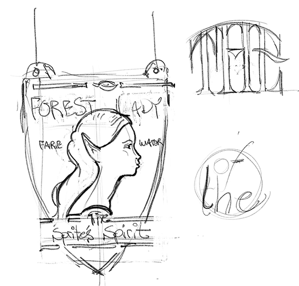
Peter's second sign was a shield shaped sign promoting Faerie Water'. The rough sketch I have is still under going some revisions but it is going to be a nice little sign.
I tend to work in a little different fashion. When a firm idea doesn't pop into my head I simply start drawing. I settled on the name of 'TROLL's Bitter Ale'. I knew I wanted a scroll and had settled on a troll sculpt for the graphic. Negative space (AKA: a hole) in the centre of the double sided hanging sign was a must. I started scribbling my ideas down on the paper as they came to mind. The first page netted two gems I would include... a circle at the top and a troll's hand holding a glass of ale.

I was thinking a donut or oval shaped frame at this point and thought about how I might include a bridge (a place where trolls like to hang out.) but the bridge was one too many elements. A quick thumbnail of the troll proved to be an idea worth more exploration. And the scroll was worth keeping as well.

On the next page of blank paper I drew a troll that was just the right amount of fun.

The fourth page of quick scribbles netted the ideas I was looking for. The troll was perfectly fine. I decided a rough plank sign was fitting and the circle on top would sport the informal 'troll' logo. The bracket was also nailed to become part of the sign rather than just an add on.

With the idea firmly in hand and the proportions all worked out it was time to do a proper concept drawing. I did the drawing freehand in photoshop but I worked with the digital pencil using my iPad as a tablet. I sketched in layers, starting rough and then adding layers to do my final rendering. I kept my sketch purposely loose. I didn't worry about fine detail nor even fonts at this point. That would come later when I did the vector files.

My second concept came a little easier. I had the idea firmly in my head before I set pen to paper.I knew the fonts I would use before I started. In this case I did the lettering in Illustrator and set the type to the circle. The banner was also laid out in the program. When I was happy I grabbed a screen shot.

